Data Visualization With Highcharts
Motivation
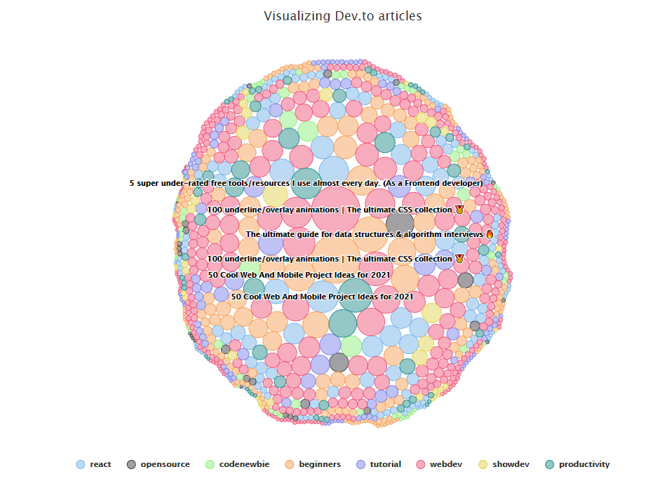
I was looking through the drafts that I wrote and thought that this one could be salvaged. I have done some simple graph visualization projects and I still think they are fun to work on. Though most of the time we just learn the APIs of the graphing libraries of our choice, these libraries work wonders to present data. So here is a short walk-through of how I would use HighCharts to showcase data from the Dev.to API. As an example, Dev.to API is used to retrieve details of 1000 articles to plot them in the form of a "packedbubble" graph. The size of each bubble refers to the reaction count (positive_reaction_count + comment_count). Then when hovered over, the title, URL, and the count of the article will be shown. The articles that have over 1000 reaction counts will be labeled. I have also arbitrarily chosen to only display articles of 8 categories/tags (More details in Step 2).
Initial Preparation
I have come to realize that a part of programming work is converting data from one form to the other. To use a front-end graphing library, in my experience having data in JSON format is the most convenient. However, there are times when the data source could be coming from CSV or Excel spreadsheet. We could either write some conversion scripts in Python or have some preprocessing steps in JavaScript. Papa Parse is one such JS helper package that I have previously used. Even if we have APIs that return us JSON formatted data, we might still need to manipulate it into the format that the charting library expects.
In this working example, I am choosing Highcharts for their rich features and extremely good documentations. They have many Jsfiddle examples that could serve as a good reference/starting point. However, do note that paid license is required to use their products commercially. To use it for free, note the following:
Non-profit organisations, schools and personal websites can enjoy our software for free under a Creative Commons (CC) Attribution-Non-Commercial license. In order to obtain a non-commercial license, please fill out this form.
The first thing to do is to find out what structure of the data is expected by Hightcharts. Sometimes this information can be confusing to figure out, given that documentations of graph/chart libraries are filled with options and explanations. So, we look at examples. This is one such example I found browsing their documentation. Looking at the code, it is easy to identify that data to be used in the chart is specified here:
series: [{
        data: [1, 4, 3, 5],
        type: 'column',
        name: 'Fruits'
    }]
So a series contains an array of individual groups of data. The actual data points are within the attribute data, in the form of an array. Upon further inspection of other examples, we can see that the data points need not be primitives like numbers or strings. They could be objects containing the data point and its metadata such as its name or other attributes. Now we are ready to proceed.
Step 1:
Fetch 1000 articles from Dev.to using the API:
async function makeGetRequestAndReturnJson() {
    const response = await fetch('https://dev.to/api/articles?per_page=1000');
    return await response.json();
}
Step 2:
Manipulate the data into the required format. Each individual data point is of the following format:
{
  'title': 'someTitle',
  'url': 'someUrl',
  'value': 'someReactionCount'
}
And the code to filter and consolidate the data is as follows (I might have gone too functional in the data processing part, use of for-loops is possible too) :
async function processData() {
    const targetTags = ['react', 'opensource', 'codenewbie', 'beginners', 'tutorial', 'webdev', 'showdev', 'productivity'];
    const seriesData = [{
        name: 'react',
        data: []
    },
    {
        name: 'opensource',
        data: []
    },
    {
        name: 'codenewbie',
        data: []
    },
    {
        name: 'beginners',
        data: []
    },
    {
        name: 'tutorial',
        data: []
    },
    {
        name: 'webdev',
        data: []
    },

    {
        name: 'showdev',
        data: []
    },
    {
        name: 'productivity',
        data: []
    }];
    const data = await makeGetRequestAndReturnJson();
    const filteredData = data.filter(article => article.tag_list.some(tag => targetTags.includes(tag)))
    filteredData.forEach(article => {
        const filteredTags = article.tag_list.filter(tag => targetTags.includes(tag))
        filteredTags.forEach(tag => {
            seriesData.find(type => type.name === tag).data.push(
                {
                    title: article.title,
                    url: article.url,
                    value: article.comments_count + article.positive_reactions_count
                })
        });
    })
    return seriesData;
}
Step 3:
Setup and use the prepared data in the graph configuration process:
async function setupGraph() {
    const seriesData = await processData()
    chart = new Highcharts.chart('container', {
        chart: {
            type: 'packedbubble',
            height: '50%',
        },
        title: {
            text: 'Visualizing Dev.to articles'
        },
        tooltip: {
            useHTML: true,
            stickOnContact: true,
            pointFormat: '<b>{point.title}:</b> <br/>Reaction Count: {point.value} <br/><a target="_blank" href={point.url}>{point.url}</a>'
        },

        plotOptions: {
            packedbubble: {
                useSimulation: false, // true for a better animation
                minSize: '30%',
                maxSize: '100%',
                zMin: 0,
                zMax: 2000, // the max value of the bubble
                layoutAlgorithm: {
                    gravitationalConstant: 0.01,
                    splitSeries: false,
                    seriesInteraction: true,
                    dragBetweenSeries: true,
                    parentNodeLimit: true,
                },
                dataLabels: {
                    enabled: true,
                    format: '{point.title}',
                    filter: {
                        property: 'y',
                        operator: '>',
                        value: 1000 // labeling the articles with over 1000 in positive reaction counts
                    },
                    style: {
                        // adjusting of styles for data labels
                        color: 'black',
                        // textOutline: 'none',
                        // fontWeight: 'normal',
                    },

                },
            }
        },
        series: seriesData,
    });
}
Step 4:
Invoke the function call when ready:
// trigger setupGraph function on document ready
document.addEventListener('DOMContentLoaded', () => {
    setupGraph();
})
Step 5:
Create a basic HTML page to run the script and display the outcome:
<!DOCTYPE html>
<html lang="en">
  <head>
    <title>DevTo Visualization</title>
    <meta name="viewport" content="width=device-width, initial-scale=1.0" />
    <meta charset="utf-8" />
    <!-- Load jQuery -->
    <script src="https://cdnjs.cloudflare.com/ajax/libs/jquery/3.4.1/jquery.min.js"></script>
    <script src="https://code.highcharts.com/highcharts.js"></script>
    <script src="https://code.highcharts.com/highcharts-more.js"></script>
    <script src="https://code.highcharts.com/modules/exporting.js"></script>
    <script src="https://code.highcharts.com/modules/accessibility.js"></script>
  </head>
  <body>
    <div id="container"></div>
    <script src="index.js"></script>
  </body>
</html>
Conclusion
Putting everything together, here is the link to see the visualization in action. Here is the link to the GitHub repo if you are interested in the code.
In terms of difficulty, most of the complexity lies in knowing the settings and configurations of the library in use. I think the harder part is finding out what to visualize and the appropriate graph/chart type to use. What story should the data tell? In my quick example, I guess it shows that people really enjoy "collectible" and "mark for further usage" kinds of articles 😂.
Some further extension ideas:
- Explore the Dev.to API to get some interesting data, such as
- filter the tags using the API parameter to only retrieve articles of certain tags
- Retrieve articles that you authored
- Explore other graph/chart types available